How to Make a Christmas Card with AI: A Tested Prompt Stack
Summary
Tested prompt stack for making christmas cards with Midjourney v7 and Flux 1.1 Pro. Three aesthetics covered: riso print, vintage gouache, and minimal. Copy-paste prompts included, plus the full workflow from brief to print-ready export. Covers text overlay, print dimensions, digital sizing, and how to animate your card in Higgsfield or CapCut.
TL;DR: How to make a christmas card with AI: pick an aesthetic (riso print, vintage painting, or minimal), run these tested prompts in Midjourney v7 or Flux 1.1 Pro, add your text in Skywork or Figma, and export at 300 DPI for print or 1280x720 for digital. Full workflow below.
Forty templates. Holly border, gold serif font, that snowflake clip art that has been in Microsoft Word since 2003. You open a design tool to make something personal and end up with something everyone else made.
AI image generation changes this. Not because it is faster than Canva (it is not, always), but because you can produce a visual that exists nowhere else. A riso print-style card that looks like it came from a small press studio in Osaka. A vintage gouache illustration that reads like a 1960s East German book. A botanical flat-lay you would actually want to receive.
This is the tested workflow from brief to print-ready file. Prompts included.
Start With the Brief, Not the Tool
Most tutorials jump straight to "open Midjourney, type Christmas." That is how you get the same card everyone else is sending this year.
Art directors do not open the tool first. They write a brief.
Before you generate anything, decide three things:
Aesthetic: riso print, vintage gouache painting, or minimal with type added in post
Palette: two or three colors max, and consider moving past the obvious red and green
Format: print (A5 or 4x6in postcard) or digital (1280x720 landscape)
Write these down in one line. A one-line brief is enough to stop you accepting the first mediocre output. "Riso print, forest green and burnt orange, single pine branch, A5 portrait" beats no brief every time.
Three Aesthetics That Work in AI
Riso Print
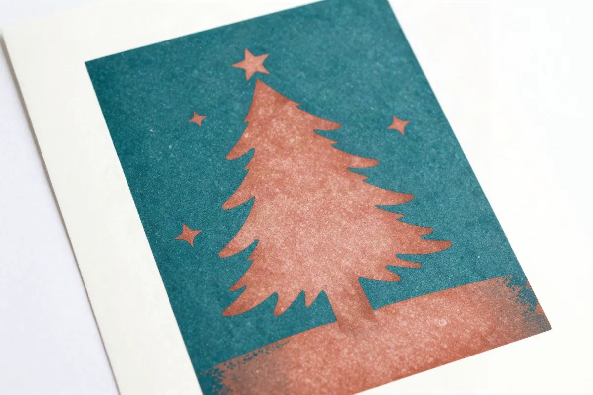
Risograph printing uses layered spot colors: limited palette, slight misregistration, grain texture. It reads as handcrafted and specific. Nothing on Shutterfly looks like it. That is the point.
Midjourney v7 handles this aesthetic better than Flux. The --style raw flag is important here. Without it, Midjourney smooths the grain and you lose the texture that makes riso print distinctive.
Vintage Gouache Painting
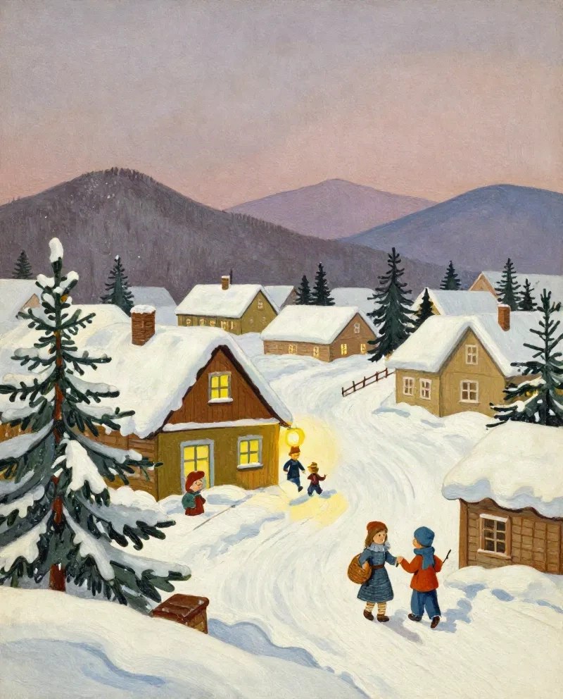
Think Eastern European children's book illustration from the 1960s and 1970s. Flat shapes, slightly desaturated palette, visible brush texture, warm but not saccharine. The kind of card you might actually keep.
Flux 1.1 Pro handles this better than Midjourney. Painterly texture in Flux outputs tends to feel more considered, less synthetic.
Minimalist with Type Added in Post
One strong graphic element (a branch, a single ornament, a geometric shape) on a clean field. This is the hardest to pull off in pure AI because text generation in image models is still unreliable in 2026. Plan on adding your typography manually in post, every time.
Best approach: generate the visual element with Midjourney or OpenArt, export clean, add type in Skywork or Figma.
Tested Midjourney v7 Prompts
These have been run and evaluated. Copy, paste, and iterate from there.
Riso print christmas card:
riso print christmas card, two-color spot print, deep teal and warm red, small forest animals around a pine tree, grain texture, slight misregistration, flat shapes, white paper background, print-ready --ar 2:3 --style raw --v 7Vintage illustration:
vintage christmas card illustration, 1960s Eastern European children's book style, gouache paint texture, snowy village scene, muted warm palette, flat perspective, desaturated --ar 2:3 --style raw --v 7Botanical minimal:
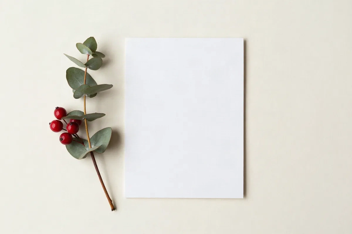
minimal christmas card, single eucalyptus branch with red berries, top-down flat lay, cream background, natural morning light, photorealistic, clean composition, no text --ar 2:3 --v 7Abstract geometric:
geometric christmas card design, abstract winter landscape, limited color palette navy cream burnt orange, mid-century modern illustration style, silkscreen print look, no text, flat graphic --ar 2:3 --style raw --v 7Run each prompt at least three to four times before selecting. The variance between outputs is real. The --style raw flag prevents Midjourney from applying its default aesthetic polish, which dulls the graphic quality on illustrative prompts. Remove it if you want a more commercial finish.
For --ar 2:3: portrait format for A5 or 5x7in print. Switch to --ar 3:2 for landscape, --ar 1:1 for square digital cards.
Flux 1.1 Pro: Same Brief, Different Feel
Flux handles photorealistic texture and painterly detail better than Midjourney. It is less opinionated stylistically, which means your prompt description does more of the work.
Gouache painting (Flux):
christmas card, gouache illustration, warm candlelit interior, a table with pine branches and a single candle, rich saturated paint texture, visible brushwork, flat midground, 1970s childrens book cover style, portrait format, no textRiso-adjacent (Flux):
risograph-style christmas print, two spot colors forest green and terracotta, abstract pine tree forms, grainy texture overlay, minimalist composition, white paper background, portrait cropHonest comparison: Midjourney v7 is stronger for graphic, illustrative, and stylized aesthetics. Flux 1.1 Pro is stronger for painterly textures and anything that needs to feel physically printed. Run both on the same brief and pick the stronger output. The five extra minutes are worth it.
If you want to test both models without switching platforms, OpenArt lets you run the same prompt across Flux, SDXL, and several other models in one place. Useful when you are not sure which model fits the brief.
Adding Text: The Part AI Still Gets Wrong
AI image models are unreliable at rendering text. Not broken, just unreliable. You might get clean lettering once in twenty outputs. Plan around this rather than fighting it.
The workflow:
Generate your visual with no text. Add "no text, no lettering" explicitly to your prompt.
Export the best output at full resolution.
Open in Skywork, Figma, or Illustrator.
Add your message as a type layer at high contrast.
For print: serif or humanist sans at high contrast. White type on dark areas, or dark type on the cream or white negative space you deliberately left in your prompt. Adding "leave empty space at bottom third for text, clean negative area" to your prompt works about 60% of the time and is worth including every time.
For digital: same approach, but your final export is RGB and resolution requirements are lower.
Print-Ready Export Setup
Standard sizes:
A5: 148x210mm (standard European card)
4x6in US postcard: 102x152mm
5x7in US greeting card: 127x178mm
Resolution: 300 DPI minimum for print. Midjourney v7 outputs at 1024px or 2048px depending on upscale settings. For A5 at 300 DPI you need 1748x2480px. Use the Upscale (2x) button in Midjourney, then run through Magnific or Topaz Photo AI for final print-quality sharpening if needed.
Color profile: AI outputs are sRGB. Most print shops want CMYK. Convert in your design software before exporting. Print-on-demand services like Printful and Minted often accept sRGB. Check their file specs page before submitting.
Bleed: add 3mm bleed on all sides if sending to a commercial print shop. Not needed for personal inkjet printing.
Digital Cards: The Shorter Route
If you are sending digitally, the workflow is simpler and faster.
Dimensions: 1280x720 for landscape (works on every screen), 1080x1080 for square if you are posting to Instagram.
Format: PNG for static cards. For animated, use MP4 rather than GIF. WhatsApp compresses GIFs aggressively and the result degrades. MP4 plays cleanly on every platform.
Animation: generate your static card first, get the visual right, then add motion in Higgsfield or CapCut. A subtle parallax effect or a slow snow particle overlay over five seconds, looped. Keep it short. The image is the content. Animation should support it, not compete with it.
Iterate Like This, Not Like That
The patterns that produce generic results:
Accepting the first output. Run four to eight variations before selecting. The gap between the first output and the fourth is often significant. Prompt quality matters, but so does selection.
Describing an adjective instead of a visual. "A beautiful christmas card" tells the model almost nothing. "Riso print, forest green on cream, pine branches, grain texture" gets you somewhere. Describe what it looks like, not how it should feel.
Overloading with too many elements. One focal point. One supporting element. White space is not waste in a christmas card. It is where the text lives, and it is what makes the visual breathe.
Using the AI output as-is without typography. The card is not finished when you export the image. AI visual plus real typography is the gap between a finished piece and an experiment. The type layer is not optional.
Not specifying format. Add portrait format or landscape format and the actual aspect ratio to every prompt. Models default to square or widescreen crops that do not fit standard card dimensions.
The Stack in Summary
Generate: Midjourney v7 for graphic and illustrative styles, Flux 1.1 Pro for painterly and photorealistic
Multi-model testing: OpenArt AI, same prompt across multiple models in one interface
Text and layout: Skywork or Figma
Animated digital version: Higgsfield or CapCut
Print upscale: Magnific or Topaz Photo AI
Steal the prompts above. Run four variations. Pick the strongest output. Add your text. That is the whole process.