Family Christmas Card Photo Ideas That Hold Up in Print
Summary
The best family christmas card photo ideas share one trait: a single concept, a two-color palette and a quiet area for the greeting. Try the back-of-the-heads shot, a one-prop joke or a details-only card. Use AI before the shoot to pre-visualize light and layout, and after it to build a backdrop. Never use it to invent family members. Shoot for twelve minutes, then stop.
Pick one idea, one palette and one joke or one feeling, then shoot it. That is the whole trick behind the family Christmas card photo ideas below. Most cards fail because the photo tries to be a portrait, a greeting and a punchline at the same time. Decide what the card is about before anyone puts on a sweater, and use AI where it saves you time (pre-visualizing the shot, building a backdrop, planning the layout), never to invent a family that does not exist.
Start with the card, not the camera
Open any "50 ideas" list and you get a pile of poses. Porch, tree, snowman, matching pajamas. Fine, but nobody tells you how to choose.
Here is the filter we use. A card gets looked at for about two seconds on a fridge or a mantel. In two seconds it can carry one image, one color story and maybe six words of text. That means your photo needs a clear subject, a calm area where the greeting will sit, and a palette that survives printing.
Before the shoot, write three lines on a sticky note:
The feeling: cozy, chaotic, deadpan, nostalgic.
The palette: two colors plus a neutral. Tomato red and pine green on warm white is the classic, and it works for a reason.
The crop: vertical or horizontal, and where the text goes.
Skip this and you will end up with 300 frames and no card.
Which family Christmas card photo ideas hold up in print?
Some ideas look great on a phone and die at 5x7. These are the ones that survive.
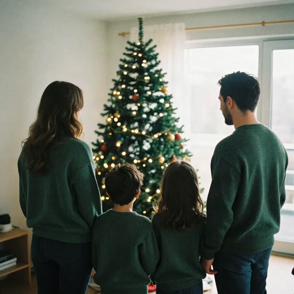
The back-of-the-heads shot. Everyone faces the tree, nobody faces the lens. No one has to smile on command, the kids cannot ruin it, and the tree does the emotional work. It also leaves a clean area for text above or beside the group. Steal this one first.
The one-prop joke. A single empty gift box, a ladder, a tangled strand of lights. One prop, one reaction, done. The second prop is where the joke dies.
The kitchen counter, mid-chaos. Flour, cookie cutters, hands in motion. It reads as a real afternoon, not a staged one. Shoot wide first, then go in on hands.
The color-matched outfits. Not identical sweaters. Same two colors, different cuts. It looks like a family that dresses itself, which is what you want.
The details-only card. For the relative who refuses to be photographed: socks at the end of a bed, a mug, a wrapped box, an ornament with a thumbprint on it. A card without faces can still be personal.
The window-light portrait. One row, simple wall or tree behind, everyone close. Boring on paper, great on a mantel. Use it as your safe frame and shoot your funnier idea second.
What to skip: the twelve-person pyramid, anything that needs a stranger to hold your phone, and any prop that needs a safety talk. If a pose takes more than five minutes to explain to a four-year-old, it is not a card idea, it is a tantrum.
Where AI helps (and where it should stay out)
This is the part the usual photography blogs do not cover. You do not need AI to take a family photo. But you can use it before and after the shoot, and it saves real time.
Before the shoot: pre-visualize. Describe the scene and look at a dozen versions in a few minutes. You are not generating your family. You are testing compositions: where the tree sits, how much empty sky you need for text, whether green on green works. Walk in with a shot list instead of improvising for forty minutes.
After the shoot: build the backdrop, not the people. Plain wall behind the family? Generate a snow-lit window or a textured paper background to composite behind them, and match the light direction of your real photo. That is the honest use. Faces and bodies stay real.
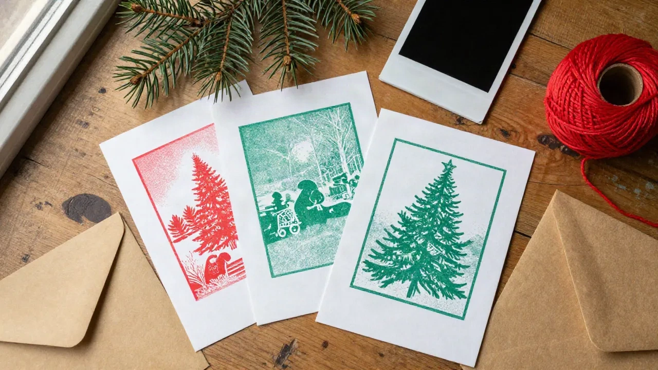
For the card itself: the illustrated version. If you do not want a photo at all, a two-color illustration can carry a card. Riso prints with slightly misregistered ink are a whole look, and models handle that texture well.
Where AI should stay out: swapping in faces of people who were not there, removing a relative from the group shot without telling them, and anything you would not be comfortable explaining to the person on the card. A holiday card is a small piece of trust. Keep it.
Prompts to steal for the pre-visualization step
These are starting points, not scripture. Drop them into your model of choice and adjust the light.
Back-of-the-heads layout test
A family of four seen from behind in matching dark green knit sweaters, facing a lit Christmas tree in a small apartment living room, window daylight from the right, film photograph, Kodak Portra 400 grain, shallow depth of field, faces not visible, large calm wall area at top for text
Riso card illustration
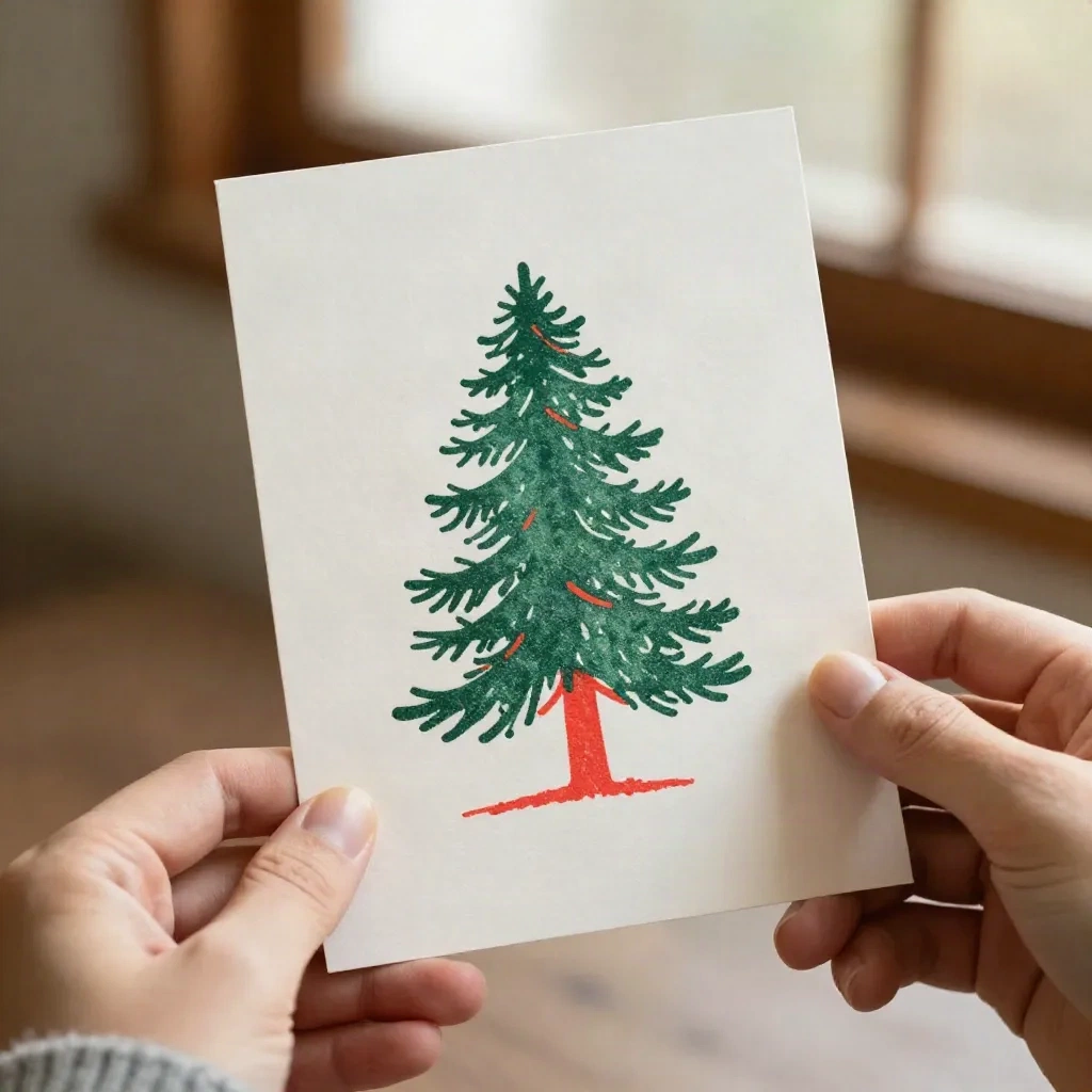
Minimalist two-color riso print of a pine tree, tomato red and forest green ink on warm white paper, slight misregistration, visible paper grain, generous empty margin at the bottom, no text
Kitchen counter chaos
Overhead candid photograph of flour, cookie cutters and children's hands decorating star-shaped cookies on a wooden counter, side window light, warm tones, 35mm film look, no faces
Backdrop for compositing
Empty snow-lit window with sheer curtain, soft blue-white daylight from the left, textured plaster wall, no people, no furniture, space in the center for a family portrait
Remix if you want, but keep the light direction consistent with your real photo. Mismatched shadows are the first thing people notice.
Midjourney is still the easiest place to chase a film-stock mood or a riso texture. It tends to over-style, so say what you do not want.
Flux follows lighting instructions more literally. If you need "window light from the right" to actually come from the right, start here.
Nano Banana is handy for editing a frame you already shot, like swapping a cluttered wall for a clean one. Use it on backgrounds, not people, and check the corners of the output before you print.
Magnific earns its place at the end: if your favorite frame is soft or your backdrop came out small, upscale it before sending it to print. Cards are held at arm's length, but a 5x7 print is less forgiving than a screen.
Three palettes that print well
Color is the cheapest way to make a card look designed. Pick one of these and build the outfits, props and any illustrated elements around it.
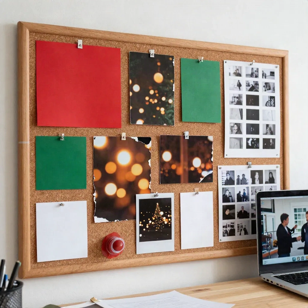
Tomato red, pine green, warm white. The classic. Hard to get wrong, and it looks right on kraft envelopes. Keep the red to one or two items so it stays an accent.
Deep green, mustard, cream. Calmer and a bit vintage, the Kodachrome-adjacent option. Works well for the back-of-the-heads shot because the tree and the sweaters already do half the job.
Navy, white, a single red. For people who dislike the usual holiday look. A navy room, white snow, one red scarf. It is restrained, and it prints cleanly.
Whatever you choose, test it at the pre-visualization stage. Describe the palette in your prompt, look at a few versions, and you will know in five minutes whether the green you own matches the green you imagined. Nobody wants to learn that at the print proof.
Mistakes that ruin an otherwise good card
Busy backgrounds. A shelf full of objects behind the family kills the text zone. Move the family, not the shelf.
Mixed light. Window daylight plus a warm lamp plus the tree lights gives skin three different colors. Turn off what you can.
Too many props. One prop is a joke. Four props is a yard sale.
Forcing the smile. The unposed frame, the one where the baby looks at the dog, is usually the one people keep.
Editing the life out of it. Smoothing every face and cleaning every shadow makes the photo feel like a stock image. A little grain and a little mess read as real.
How to shoot it when you only have 20 minutes
Most families get one window, one afternoon, and one kid who is at peak patience for about eight minutes. Plan around that.
Light first. Put the family near a window, tree behind them. Daylight beats any lamp you own.
Test the frame. Take one shot with a phone propped on a stack of books and check where the text will go.
Shoot the safe frame. Simple row, everyone close. Get it done in two minutes.
Shoot the idea. Back-of-heads, prop joke or counter chaos. Burst mode, short bursts.
Stop. Seriously. The photo after minute twelve is never the one you pick.
Layout notes nobody gives you
A few things that make the difference between "nice photo" and "nice card".
Leave a text zone. About a third of the frame, quiet, low contrast. Wall, sky, snow, blurred tree. If you only notice the empty space after the shoot, you can extend the canvas, though it is much easier to plan it.
Check the crop at the printed size. Faces near the edge get trimmed by printers. Keep heads away from the outer fifth of the frame.
Mind the bleed. Pick your print service before you edit, because each one has its own image size and bleed requirements.
Keep the type small and honest. Six words and a name. "Merry Christmas from the Okafors" does not need a paragraph.
Print one test. A single proof on the cheapest paper tells you more than an hour of squinting at a monitor. Greens shift in print, so check them.
Should you go photo, illustration or both?
Honest take: go photo if the family is the point, go illustration if the mood is the point, and do both if you are sending to two kinds of people.
A real photo wins with grandparents, always. An illustrated card wins with friends who get a lot of cards and have seen every sweater pose. The hybrid works too: a small photo inset on a printed, riso-style card, with the AI used only for the illustrated part.
Skip the AI-generated "family" entirely. People can tell, and the recipient who knows your actual kids will feel it immediately. It is also the one use on this list that makes the card worse.
What we'd actually send
If we had one afternoon: the back-of-the-heads shot as the main card, the window-light portrait as the safe backup, and a two-color riso tree on the back for texture. Total cost is a tripod, a window and one coffee.
Your move. Write the three lines on a sticky note, pick the frame, and copy one prompt above into your model of choice to plan the light before anyone puts on a sweater. Then shoot it and stop at minute twelve.