AI Generated Landscape Prompts That Actually Hold Up
Summary
An ai generated landscape only reads as real when light, scale and atmosphere are deliberate, not when the prompt is long. We tested the same brief across Midjourney v7, Flux 1.1 Pro and Stable Diffusion 3.5: the six-slot structure that actually moves the render, the single-figure scale trick, the camera specs worth keeping, and the color-banding issue SD3.5 still has on wide sunset gradients.
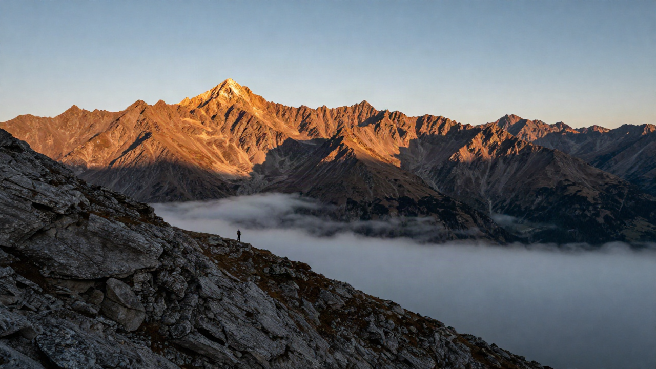
An ai generated landscape only reads as real when the model knows what to do with light, scale and atmosphere, not when the prompt is long. We ran the same brief across Midjourney v7, Flux 1.1 Pro and Stable Diffusion 3.5 to see which parts of a landscape prompt actually move the render and which ones are just padding. Short answer: six slots beat six adjectives, every time, and the slot everyone skips is the one doing most of the work.
Same Prompt, Three Models, Three Different Landscapes
We fed all three models the exact same brief: alpine ridge, golden hour, low fog in the valley, hiker for scale. Same words, same order, five seeds each, same fixed seed range so we weren't comparing a lucky roll against an unlucky one.
Midjourney nailed the mood first and the geography second. Ridges felt believable, the fog had weight, but the rock formation was clearly invented the moment you looked at it for more than a few seconds.
Flux respected the ridge geometry almost to a fault. It treats camera and lens references as instructions, not vibes, so "32mm, f/11" actually changed the depth of field across the four layers of the scene, not just the foreground.
SD3.5 gave us the flattest result of the three. Usable, but it needed an extra pass of grain and a film stock reference before it stopped looking like a render straight out of a game engine.
None of them are "the best" here. They're different tools reacting to the same six slots in different dialects. Pick based on what you're actually shipping: a moodboard leans Midjourney, a client-facing hero image leans Flux, a fast batch of variations leans SD3.5.
The Six-Slot Structure, Applied to Scenery
We've said this before about portrait and product prompts, and landscapes don't get a pass: subject, style, light, composition, mood, technical. Skip a slot and the model fills it with the most generic option it has.
For scenery specifically, "composition" is the slot everyone drops first, and it's the one that separates a photo from a screensaver.
Think in layers, not in one flat "beautiful view." Foreground interest, mid-ground subject, background depth, sky drama. Four layers, four sentences, done.
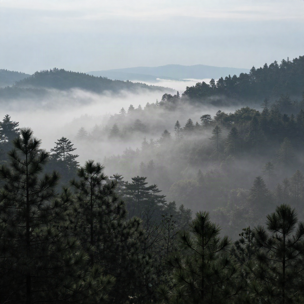
The forest shot above ran on exactly that: "dark pine silhouettes foreground, fog-wrapped hillside mid-ground, pale ridgeline background, overcast diffused light." No adjectives about how pretty it is. The layering did the work.
Broken down, the six slots for that image were:
Subject: pine forest valley
Style: ultra-realistic photograph
Light: soft diffused overcast
Composition: foreground silhouettes, mid-ground fog, background ridgeline
Mood: quiet, damp, still
Technical: 24mm wide angle, long exposure feel on the fog
Every slot filled, none of them fighting each other. That's the whole trick. A prompt that's twice as long but only fills two slots twice will lose to this one every time.
Drop this into Midjourney first if mood matters more to you than geometry. It's still the model with the strongest read on atmosphere, even when the terrain underneath is a little bit fiction.
Scale Is the Cheat Code Nobody Uses Right
Every landscape prompt guide says "add something for scale." Almost none of them say where, or why it changes the render's math, not just the composition.
A model without a scale reference has no idea how big anything is. Mountains, dunes, cliffs, they all default to a vague mid-size that reads as generic no matter how detailed your rock texture prompt is.
Put a single small figure or object on a ridge, a dune crest, a shoreline, roughly at the golden-ratio point of the frame. Not centered. Not two figures. One.
Why one and not a group: a group reads as "a place people go," which drags the model toward tourist-brochure staging. A single distant figure reads as "a place that exists," which is the feeling most landscape briefs are actually chasing.
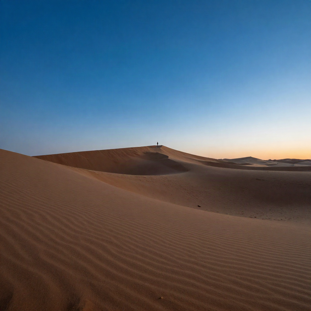
We tested this dune shot with and without the figure. Same seed range, same prompt otherwise. Without it, the dunes looked like a desktop wallpaper. With it, the scale snapped into place and the whole image read as a real place.
Camera Specs That Actually Move the Needle
"8K ultra realistic" does nothing. We've tested it enough times to say that flatly. Resolution keywords are theater, not instruction.
What actually changes the render: focal length, aperture, and a real camera or lens name. Flux 1.1 Pro in particular treats these as optical instructions, not aesthetic flavor text, because its training leaned hard into photography-accurate depth of field and lens character.
A few that consistently earn their place in the prompt:
14mm ultra-wide for dunes, deserts, anything that needs foreground-to-horizon sweep
200mm telephoto for compressed, layered mountain ridgelines that stack instead of sprawl
f/11 for landscapes you want fully sharp front to back
A named sensor or camera body when you want the model to commit to a specific optical signature instead of averaging across every camera it's ever seen
Don't stack contradictory specs in the same prompt. "14mm ultra-wide, f/1.4, telephoto compression" is three different photographs arguing with each other, and the model will average them into mush rather than pick a winner.
SD3.5 responds to these terms too, just less literally. Treat it as a nudge, not a contract, and you won't be disappointed. It'll shift the light and the depth cues in the right direction without committing to the exact optical math the way Flux does.
Where SD3.5 Still Trips on Sunsets
Here's the one nobody puts in their prompt guide: SD3.5 has a real, repeatable issue with color banding on wide sky gradients. Push a sunset or sunrise hard enough and you'll see faint stepping in the color transition instead of a smooth blend.
We ran a dozen golden-hour skies through it to confirm this wasn't a one-off seed. It wasn't. Eight out of twelve showed visible banding at full resolution.
The likely cause is the same one that shows up in compressed video skies: a smooth gradient across a wide color range gets quantized into visible steps instead of a continuous blend, and SD3.5's sampling has less tolerance for it on landscape-scale gradients than Midjourney or Flux.
The fix is not "add more detail." It's the opposite. Add a film grain or noise reference and the banding gets masked by texture instead of fought directly. "35mm film grain, subtle halation" did more for those skies than any amount of extra sky description.
Skip the temptation to just crank up the sky adjectives when this happens. More words about how orange the sky is will not fix a rendering artifact. This is the exact kind of "skip" nobody puts in a prompt guide because it makes the model look bad instead of the user.
Weather Sells the Scene Before Location Does
Swap "mountain landscape" for "mountain landscape, incoming storm, shafts of light breaking through" and the composition improves before you've touched anything else. Weather gives the model a reason to place light, shadow and texture with intent instead of evenly.
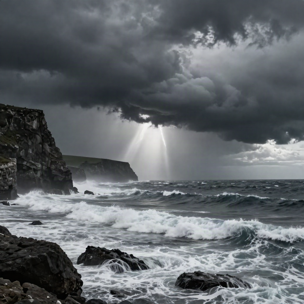
This cliff shot is doing very little geographically interesting. What's carrying it is the storm light and the spray texture in the foreground. Swap in a flat blue-sky version of the same prompt and it goes straight back to screensaver territory.
Time of day does the same job, cheaper. Golden hour, blue hour, harsh midday, overcast noon: each one tells the model where the shadows fall and how saturated the color should read, without you having to describe a single rock or tree differently.
If you want the weather itself to be the subject rather than a backdrop, Ideogram handles atmospheric text-free scenes cleanly and keeps the sky from turning muddy at extreme aspect ratios.
Breaking Realism on Purpose
Not every ai generated landscape needs to pass as a photograph. Sometimes the brief is a riso-print gradient sky with rock formations that shouldn't stay up, and photorealism is the wrong target entirely.
For that, drop half the camera-spec slots. Keep subject, style and mood, and let composition and color palette carry the image instead of optical accuracy.
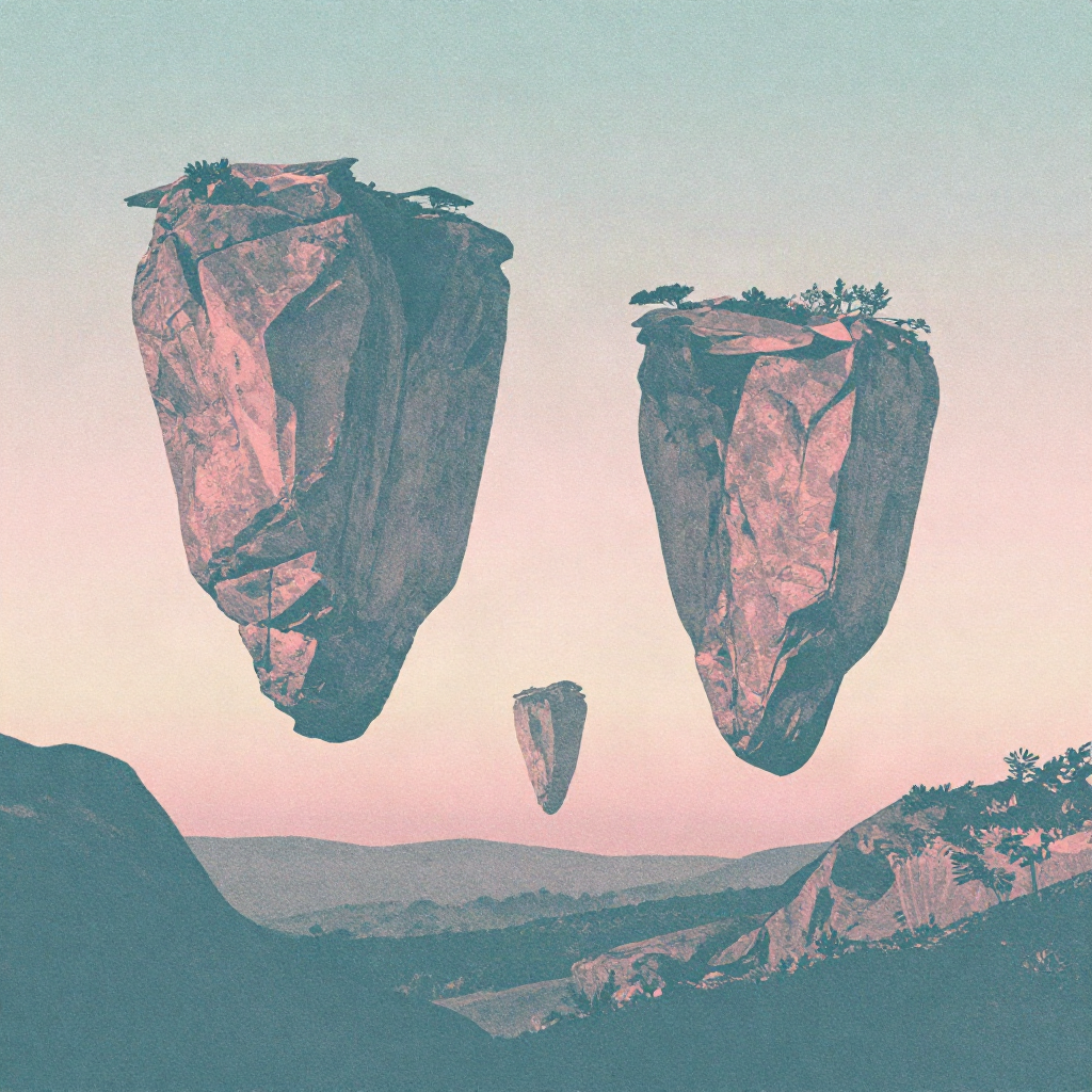
This one ran on a two-color palette limit and a halftone grain reference instead of a lens. No camera body mentioned anywhere in the prompt. The moment you add one, the model tries to reconcile it with the impossible geometry and the whole thing collapses back toward generic.
This mode is worth reaching for on album art, editorial spreads, riso-adjacent zine covers, anywhere the brief wants "obviously constructed" over "obviously photographed." Fighting the model back toward realism here just wastes generations.
Leonardo AI's style-reference workflow is worth a look here if you're building a recurring surreal series instead of a one-off image. It holds a palette across a batch better than most, which matters more than raw output quality once you're producing a set instead of a single hero shot.
Four Prompts Worth Stealing
Copy these, swap the location, keep the structure intact.
"Ultra-realistic landscape, jagged coastal cliffs, incoming storm, shafts of light through cloud break, tiny figure on the shoreline for scale, 200mm telephoto compression, moody desaturated grade"
"Misty pine valley, foreground silhouettes, fog-wrapped mid-ground hillside, pale distant ridgeline, soft diffused overcast light, 24mm wide angle, muted color grade"
"Wind-carved sand dunes at blue hour, single figure on distant ridge for scale, 14mm ultra-wide, f/8, clean digital grade"
"Surreal floating rock formations, pastel gradient sky, two-color riso palette, halftone grain, no camera reference"
Steal this, remix the location and the light, and don't add the camera spec back into that last one.